Visualizing Running Activity
I’ve been on a data visualization kick lately and decided to make some visualizations of runs I’ve done this year. My inspiration for this project came primarily from seeing Aaron Koblin’s Flight Patterns map and this map by Eric Fisher plotting Flickr/Twitter metadata in major cities. I typically run the Wildwood Trail (in Portland, OR). I wear a Garmin watch that uploads data to Garmin Connect, which I can then export in GPX format.
I hunted around for tools to use for doing the mapping. I stumbled across a GitHub repo called GpxTrackPoster, which I forked so I could add Dockerfiles for running the code. After dumping a handful of runs from Garmin Connect, I ended up with this:
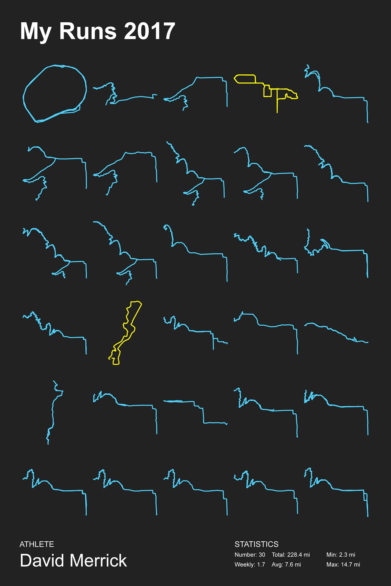
(The yellow routes represent races. I did the Sisters Half Marathon and the Pacific Crest 10k this year). I was pretty happy with this. But I also wanted to have a heatmap of my runs.
First, I looked into doing this with Processing, a popular platform for building data visualizations that uses a simplified Java syntax. There’s a library called UnfoldingMaps for it. Unfortunately, as of this writing, this library isn’t compatible with the latest version of Processing. After downloading an earlier version and fiddling with it, I decided to switch to using MapBox instead.
MapBox is a really popular SDK for building all kinds of mapping apps for several different platforms. Their API is very well-documented and it’s easy to get up and running with it. I stumbled across this tutorial on visualizing workout activities with MapBox, which was exactly what I was trying to do.
After following the steps, I ended up with this in a few minutes.
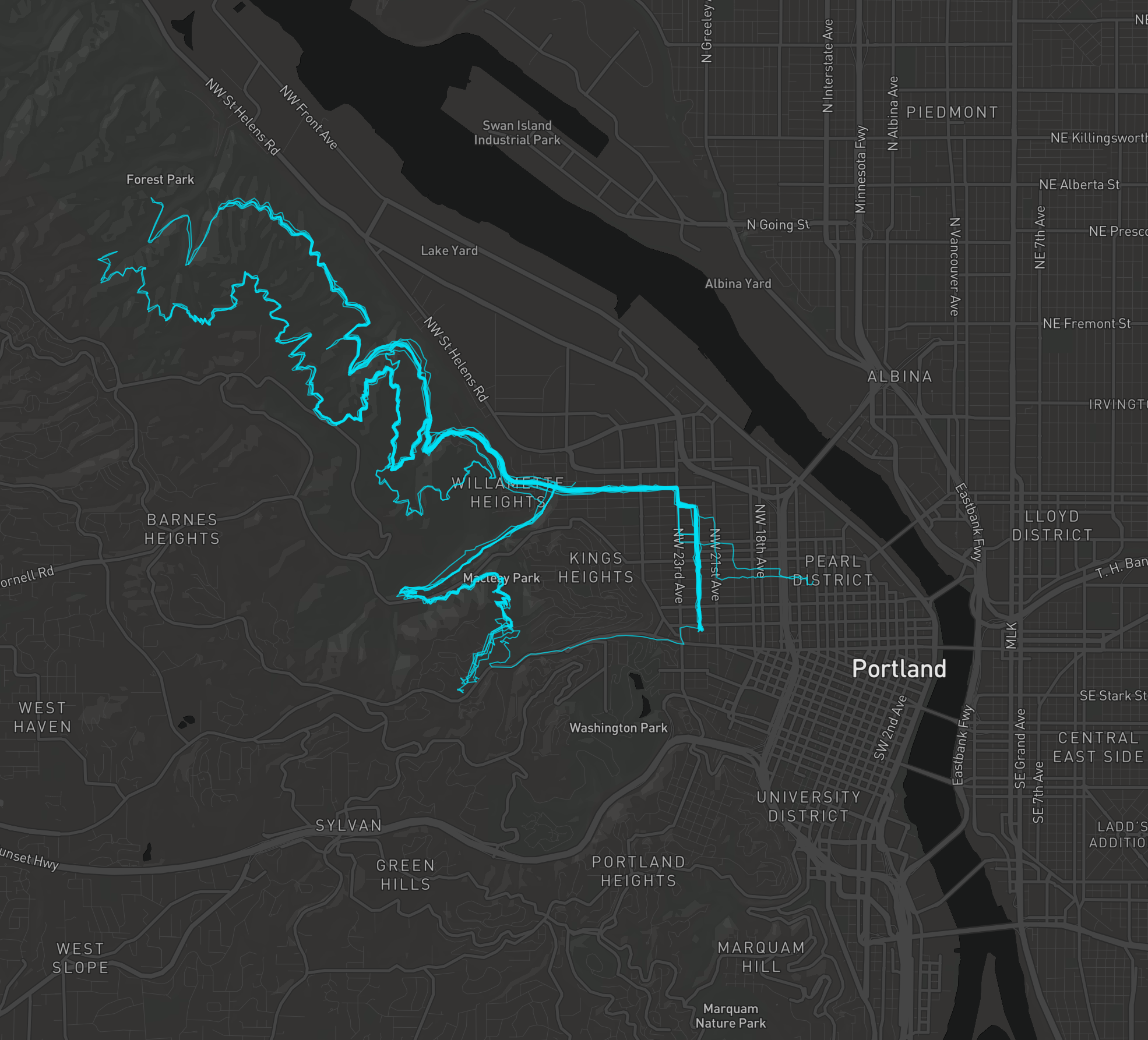
Nice ![]() .
.
Other cool stuff you can do with MapBox:
- Make a 3d Minecraft map
- Augmented reality maps with iOS 11’s ARKit
- Another awesome augmented reality map of San Francisco
For more inspiration, check out the #BuiltWithMapBox hashtag.
Comments